Top Web Design Trends for 2021
Every year, we see new trends that emerge in web design. As a digital marketing firm, we enjoy keeping up with what’s hot and what’s not and helping our clients incorporate certain design elements into their website and branding. Read more for the top web design trends you’re likely to see in 2021.
Editorial Note: The site examples shown below aren’t our creations.
1
Frosted Glass Effect/Blurriness
A frosted glass effect or “blurriness” has become a popular tool for designs and is more and more being used as a background element instead of a gradient.
A “gaussian” blur works well in providing a swirl of soft focus to images and gradients. While this tool has been around for a while, advances in technology have allowed it to be implemented more easily.
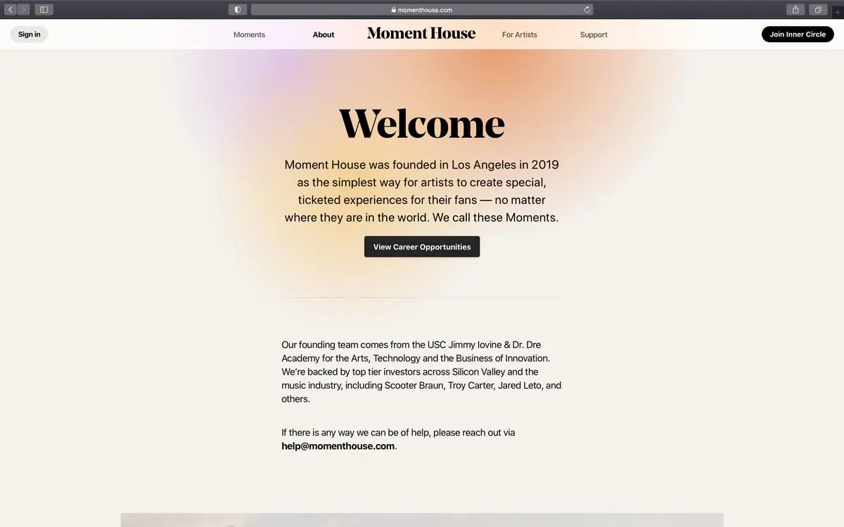
Source: Moment House
2
Dark Mode
Have you experienced the dark mode on your iPhone? Black is back because dark mode is hitting more screens in 2021. You may not realize it, but your users or customers may want to have the ability to toggle between dark mode and light mode, a la the iPhone.
Remember that when it comes to light and dark mode, simply switching from black to white or vice versa isn’t going to cut it. Your design scheme should contain palettes for both modes to allow for a beautiful theme that is specific to each mode.
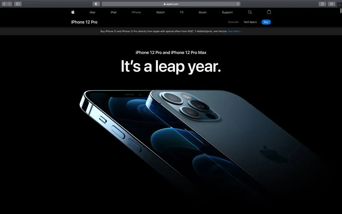
Source: Apple
3
Increased White Space
Designers have always appreciated white space, and that has never been more true than now. One reason white space is popular is that it allows one element to “pop” or be the center of focus on a piece or a site.
White space is the term for the spacing we give between elements. It does not have to necessarily be white, as long as the area is devoid of any other elements. This is why it’s also known as “negative space.” White space also has a beautiful, classic feel that’s easy to adjust for any number of projects.
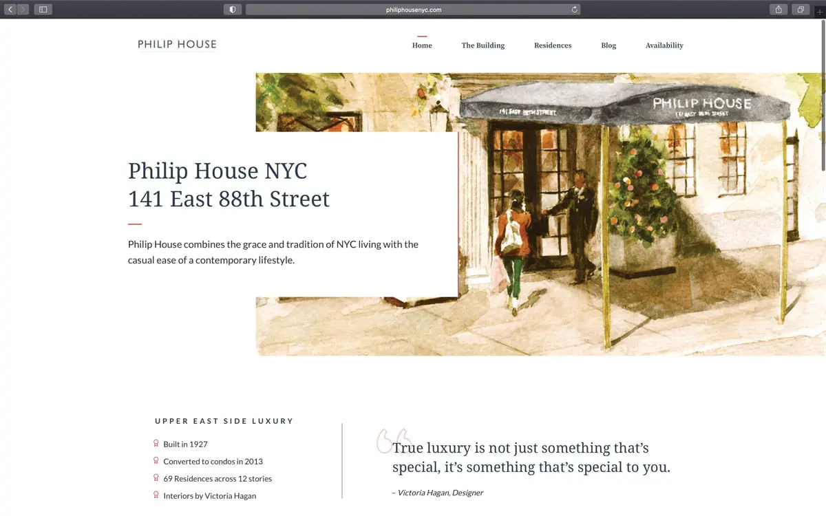
Source: Phillip House
4
Organic Shapes
Another web design trend we are loving is the use of abstract shapes. We are seeing brands use more unique shapes that give an extra element of intrigue for its customers or users. The elje group does a great job of introducing abstract shapes and graphics that resemble a lava lamp and will keep users interested. Notice this company has integrated a few 2021 web design trends, including modern gradients and diagonals in the intro when you load the page!

Source: elje Group
5
3D Elements
3D design elements have intrigued website users for many years. Thanks to evolving web technology and web designers constantly upping their game, 3D elements are continuing to grow in popularity.
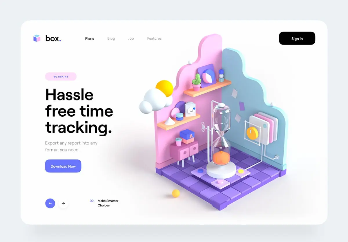
Source: Tran Mau Tri Tam
6
Mixing Photo and Graphic Elements
You might have noticed overlapping graphics on images in your social media feed. This mixing technique brings a level of creativity and fun to a typical image.
The trend is also catching on with websites. Mixing photography with graphics can reinforce your company branding and keep website visitors engaged with your content.
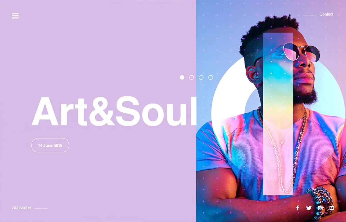
Source: StudioJQ
7
Bold Color Schemes
Colorful minimalism goes hand-in-hand with one of 2021’s most prominent web design trends: color! Bold, bright, saturated colors help your brand stand out from the soft neutrals that many companies have chosen over the past few years.
bubly, the sparkling water company, is an excellent example of how a site can use bold, saturated color without overwhelming the eye. Their branding is all about colorful cans, and their website is an extension of their brand.
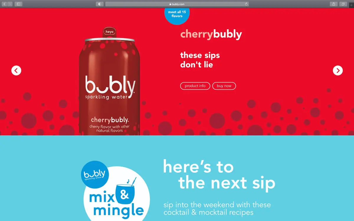
Source: Bubly
8
Bold Typography
If you look at some of the biggest brands in the world, you will see that bold typography is on-trend. With heavy, bold fonts, the reader is instantly drawn into the message, not necessarily the imagery. Combining these large fonts with neutral colors further emphasizes the headlines, quickly becoming an “image” of their own.
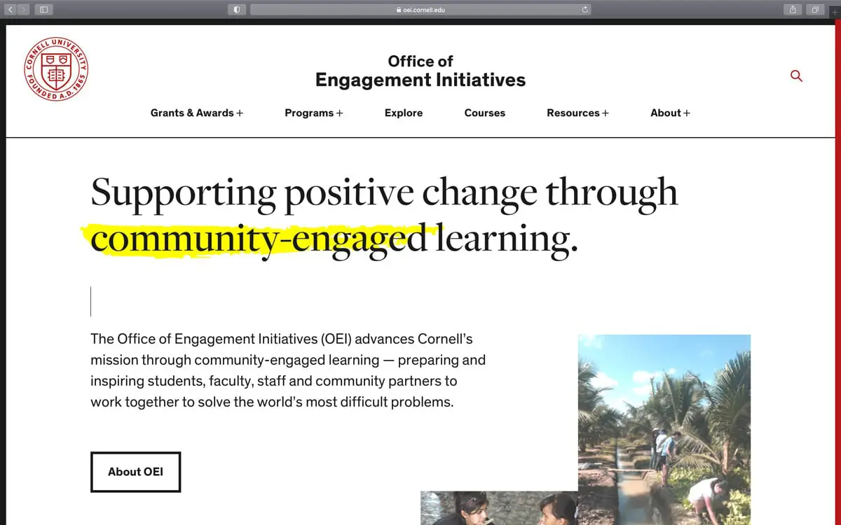
Source: Cornell University
B
Bonus: Scrollytelling
We’ve seen a growing trend in designers telling stories through web experiences. This is where scrollytelling comes in — visual storytelling that heightens a story and hooks you into its narrative.
The best applications of scrollytelling practice restraint:
Keep motion within a small area.
Provide interactions on the user’s terms: provide obvious playback controls to play/pause/stop interactions and motions.
Make sure that any scrollytelling elements help to emphasize the story, rather than distracting from important text.
It’s always exciting to see how web design continues to evolve and change. If you’re ready to build an engaging new website in 2021, get in touch with us today.

